
You’ve already done all the hard stuff: designing and distributing your survey. And now the results are rolling in. What’s left to do? Show off your survey results in a fantastic presentation to your boss, of course.
Making your data look good in a presentation is actually pretty fun, and it’s easy to do from inside SurveyMonkey’s Analyze tool.
Here are some tips to help you make sure your graphs are easy to read and reflect your brand.
Get deeper insights from your data
Learn all the ways to analyze your survey results so you can make even better decisions.
Clean up your graphs
When you first open up Analyze, you may have a ton of survey results to deal with. While your results can provide a wealth of useful information, your presentation needs to be clear and concise.
Be selective with the graphs you use, and make sure they’re looking their best when presenting survey results. Cleaning them up inside Analyze is a great place to start.
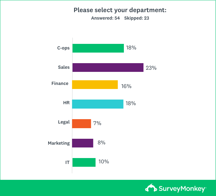
First, edit your graph labels. If your questions contain numerous answer options that don’t fit well on the graph, you can remove the less commonly selected choices so that the remaining ones fit better.
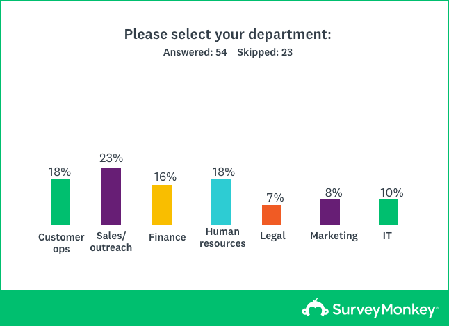
Here’s an example of what your graph might look like at first:
Click the Customize button above the chart you want to edit, then select the Labels tab in the new window. From here you can edit your labels to your heart’s content and make your line breaks look clean.
If you still aren’t quite satisfied with how your answer options look, try changing up the chart format under the Chart Type tab of the same window. Sometimes switching out a horizontal graph for a vertical one can make all the difference.
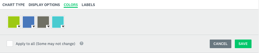
Customize those colors
Maybe lime green and teal don’t really fit the vibe of your presentation. That’s totally fine!
You can change the colors of each bar in your chart under the colors tab. Perhaps you want to change them to your company colors? Once you’ve got a color swatch you like, you can go ahead and hit "Save."
Display open-ended questions in style
Survey results from open-ended questions can be super useful in presentations, too. Showing what your respondents had to say in Customer Feedback Surveys, for example, can really drive your point home.
Consider whether a graph could accurately measure this experience:
“We had a great time at the restaurant. The wine was fabulous and our server seemed really interested in making our experience a special one. She seemed swamped though. We had to ask for our check.”
It would be tough, right? Raw numbers can be effective in demonstrating your results, but you should never underestimate the power of qualitative data.
You can get even deeper into open-ended responses with our Text Analysis features. For example, our word cloud can help break down your respondents’ most commonly used words and phrases in a way that's visually intuitive.
For instance, if your Customer Satisfaction Survey yields a word cloud with gems like “friendly,” “helpful,” and “organized,” you might want to show it off.
These tools can help demonstrate overlying patterns, behaviors, and opinions of your respondents.
Remember, if you’ve tracked your respondents using our email invitation collector, you’ll be able to see who said what.
Get ready to show off your results
You’re nearing the finish line: Your charts look great and you’ve picked out some great quotes that highlight your main points. Now it’s time to share all the hard work you’ve put into your project.
To download your customized charts, click on the down arrow icon to the left of the Analyze homepage (if you hover over it, it reads "Exports"). Then click "Export All" and select "All Summary Data" in either a PDF or Powerpoint format. From here, you can easily print PDF handouts or simply add Powerpoint slides to your presentation.
Now that you’ve got sleek-looking charts that are clean, easy to read, and in just the right format, your presentation is sure to be a hit.